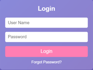
Creating a responsive login form is a crucial skill for any web developer. In this tutorial, we’ll guide you through building a sleek and functional login form using HTML, CSS, and FlexBox. Let’s get started!
Why Responsive Design Matters
Responsive design ensures your web pages look great on all devices, from desktops to smartphones. A responsive login form enhances user experience and accessibility, making it easier for users to log in from any device.
Step-by-Step Guide
1. Setting Up the HTML Structure
First, let’s create the basic structure of our login form using HTML. Here’s the code:
<!DOCTYPE html>
<html lang="en">
<head>
    <meta charset="UTF-8">
    <meta name="viewport" content="width=device-width, initial-scale=1.0">
    <title>Login Form</title>
    <style>
        * {
            margin: 0;
            padding: 0;
            box-sizing: border-box;
            font-family: Arial, sans-serif;
        }

        body {
            display: flex;
            justify-content: center;
            align-items: center;
            height: 100vh;
            background: linear-gradient(135deg, #667eea, #764ba2);
        }

        .box {
            background: rgba(255, 255, 255, 0.2);
            backdrop-filter: blur(10px);
            border-radius: 10px;
            padding: 20px;
            width: 350px;
            box-shadow: 0 4px 10px rgba(0, 0, 0, 0.2);
        }

        .form h2 {
            text-align: center;
            margin-bottom: 20px;
            color: white;
        }

        .input-box {
            margin-bottom: 15px;
        }

        .input-box input {
            width: 100%;
            padding: 10px;
            border: none;
            border-radius: 5px;
            font-size: 16px;
        }

        .btn {
            width: 100%;
            padding: 10px;
            background: #ff7eb3;
            border: none;
            color: white;
            font-size: 18px;
            border-radius: 5px;
            cursor: pointer;
            transition: 0.3s ease;
        }

        .btn:hover {
            background: #ff4d94;
        }

        .forgot {
            text-align: center;
            margin-top: 10px;
        }

        .forgot a {
            color: white;
            text-decoration: none;
            font-size: 14px;
        }

        .forgot a:hover {
            text-decoration: underline;
        }
    </style>
</head>
<body>
    <div class="box">

        <div class="form">

            <h2>Login</h2>

            <div class="input-box">
                <input type="text" placeholder="Username" required>
            </div>
            <div class="input-box">
                <input type="password" placeholder="Password" required>
            </div>
            <button class="btn">Login</button>
            <div class="forgot">
                <a href="#">Forgot Password?</a>
            </div>

        </div>
    </div>
</body>
</html>
2. Styling with CSS
Next, we’ll style our login form using CSS and FlexBox to make it responsive. Add the following CSS.
<style>
        * {
            margin: 0;
            padding: 0;
            box-sizing: border-box;
            font-family: Arial, sans-serif;
        }

        body {
            display: flex;
            justify-content: center;
            align-items: center;
            height: 100vh;
            background: linear-gradient(135deg, #667eea, #764ba2);
        }

        .box {
            background: rgba(255, 255, 255, 0.2);
            backdrop-filter: blur(10px);
            border-radius: 10px;
            padding: 20px;
            width: 350px;
            box-shadow: 0 4px 10px rgba(0, 0, 0, 0.2);
        }

        .form h2 {
            text-align: center;
            margin-bottom: 20px;
            color: white;
        }

        .input-box {
            margin-bottom: 15px;
        }

        .input-box input {
            width: 100%;
            padding: 10px;
            border: none;
            border-radius: 5px;
            font-size: 16px;
        }

        .btn {
            width: 100%;
            padding: 10px;
            background: #ff7eb3;
            border: none;
            color: white;
            font-size: 18px;
            border-radius: 5px;
            cursor: pointer;
            transition: 0.3s ease;
        }

        .btn:hover {
            background: #ff4d94;
        }

        .forgot {
            text-align: center;
            margin-top: 10px;
        }

        .forgot a {
            color: white;
            text-decoration: none;
            font-size: 14px;
        }

        .forgot a:hover {
            text-decoration: underline;
        }
    </style>